


The most beautiful thing in making games is the fact that before there is something there is nothing. Everything has to be created from scratch. Hardest thing to create is the very first thing. The spark that ignites the project.
I like playing games in my mind. Imagine a feature and surrounding and you can start playing. I just finished Motoheroz at Redlynx and was excited about physics based games. So I tried to imagine classic games and what would they be like if you add physics in them.
I stumbled into this classic 2D helicopter game in Appstore. It was crazy how addicting it was although it was just stupidly simple. Background was black. You get forward automatically. When you pushed the screen you went up, otherwise you dropped. You only dodged randomly positioned rectangles. You died if you hit anything.
What if you:
1. Add realistic physics
2. Don’t necessarily die when you hit something
3. Have beautiful visuals
4. Add interesting content
Above is the very first concept image from Badland. This image took maybe 20 minutes to create and it felt right immediately. I had already done some research but after this I had more clearer vision. It was time to start collecting more reference material.
Paintings from the Hudson River School art movement really influenced the general atmosphere in Badland. There was a peculiar combination of melancholy and striking beauty that really captivated something crucial on what was going to be Badland:
Back then Appstore was full of games that looked similar or very similar to Angry Birds. I get it. It was the most popular game and maybe developers thought this is what people want. I thought that was ridiculous. But at the same time it was a great opportunity. This is our time and chance to stand out.
Modern day animation films were and still are a great example of distinctive and jaw dropping visuals but they are also very much mass appealing. So lot of visual inspiration was drew from there:
Maybe the biggest inspiration came from real life. I used a lot of time to gather as much reference from nature as I could.
Combination between old paintings, modern day animation films and nature itself was propelled to inspire the visual look.
I got a lot of experience designing a 2D game when I did Motoheroz at Redlynx. There are some crucial principals that needed to work in this genre:
1. Scale: Understanding the distance between the closest and the farthest thing you’ll see.
2. Layers: Creating distinctive and logical environments for each background layer.
3. Gameplay: Making the actual gaming layer stand out clearly but at the same time be one with the background.
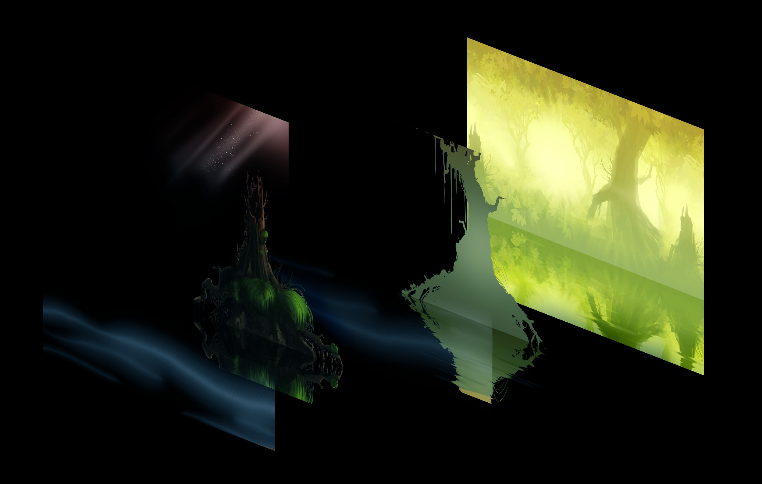
Here is the first concept with layers. Same trees, fogs and stumps were used in the game but I redid all of them later:
Fogs and glowing lights worked really well in motion. They were also the first identifiable attributes in Badland. I was surprised that these type off low opacity layers were used so rarely in 2D games.
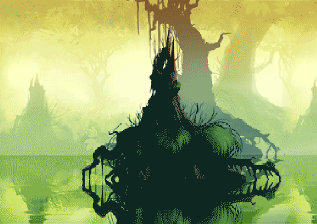
Here’s a breakdown:
At this point I knew we had something concrete here. This was far from the final look but the direction was rock solid. It was time to start figuring out what the actual gaming layer would look like.
Years back when I worked at Universomo, THQ owned game studio I saw one of the artists create main menu with nature environment in the background and black objects in the foreground. There was something visually appealing in that. I remember thinking:
“Could that be an art style for the entire game?“
After that became, Donkey Kong Country Returns, Patapon, Insanely Twisted Shadow Planet and of course Limbo.
First thing I tried were just black silhouettes. And it worked very well. I knew there would be comparisons to Limbo but I wasn’t too worried since it just looked too good to be passed and it was clear that this game and the general atmosphere would be quite different.
Above are the concept images that cemented the visual look.
Retrospectively you can see that they also worked as primary guidelines for progression (day cycles), physics based level design (chains, buzz saws, pipes, branches) and thematic confrontation (machines versus nature).
Next step was to continue painting more objects in to background. At first I made ensembles with lots of different objects in them since it was not yet possible to adjust objects position manually in level editor:
Pretty soon I realized assets needed to be more practical so I started making them much smaller pieces. This way I could do variations in level editor later on:
Assets above combined:
Here’s some more plants, rocks, trees and lianas:
Here are some variations for the furthest background layer. This layer was horizontally tiling texture and it would move very slowly in the background. At first it was sharp image but the overall layout needed more feel of depth so it was blurred. Blurring also made better contrast to the detailed hand painted main visual layer:
Here are the final background assets for each time of day:
Like the gaming layer, second furthest layer also consisted silhouette objects. Each time of day had their own set of objects. Dawn had only plants and rocks, Night almost only machines:
Idea for progression was not to make separate environments but instead make the player to move through time. Game was divided in to four different zones: Dawn, Noon, Dusk and Night.
More time advanced, more destruction happened in the environment. This was a great way to save time when making graphic assets as I was able to recycle assets from the previous levels.
The end result was interesting combination of Blurred backgrounds, ultra detailed hand painted assets and almost abstract but still logical pure black gaming layer.
I used adjustment layers from Photoshop to find the right look for each time of the day:
At first the main character in Badland was just a ball.
It was important that the character would be sympathetic and cute but not overly sweet and “casual” children’s character. So eyes were left relatively small and she would have nice fur coat. I used this old Disney tutorial for designing the body shape:
It was also important to represent incoming death if the player would be too close to the left side of screen. Then the character would look scared. Also there were variations for different types of hits.
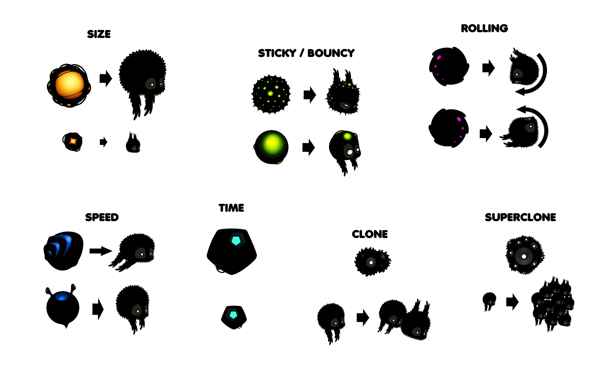
Special power ups were crucial part of gameplay. Idea was to add depth in gameplay with items that would create variation for the character and overall gameplay.
The golden idea was that you could use them together at the same time. Character could not just be bigger than normally she could be sticky, cloned and rolling in slow motion at the same time. All these possible combinations with various gameplay elements in the actual levels would create infinite amount of possibilities in level design.
Designing the physical objects started. At first there were only branches and rocks. As the project moved on more and more different types of objects and features got implemented. Here are most of the physical obstacles:
At this point we had a level editor in iPad with just the basic functions and couple of special features. Saving the level was not possible yet. Every time the app was closed the level vanished. It was actually quite liberating. I could start training level design and if I made something terrible it was gone tomorrow.
This couple week period made me learn the basics of level design in Badland. This time was monumental to really show the direction this game was going to take. It wasn’t Limbo or Jetpack Joyride. It was going to be something unique. Here are some screenshots from those early levels:
In the beginning the level editor had just the most basic features:
- Objects could be rotated, flipped and scaled
- Special objects included mine, turret, buzz saw, rotating ventilator, rotating gear.
- Special item power ups
- Background objects were randomly generated
Here’s some concept images from the early version of the level editor:
to be continued …